
Brand Identity
ONE SPACE
A creative studio wanting a luxurious gold identity with stationery and print applications.
ONE SPACE is a creative studio that wanted a luxurious gold identity without looking generic. The mark needed to work on dark backgrounds, foil stationery, and digital proposals.
The brief
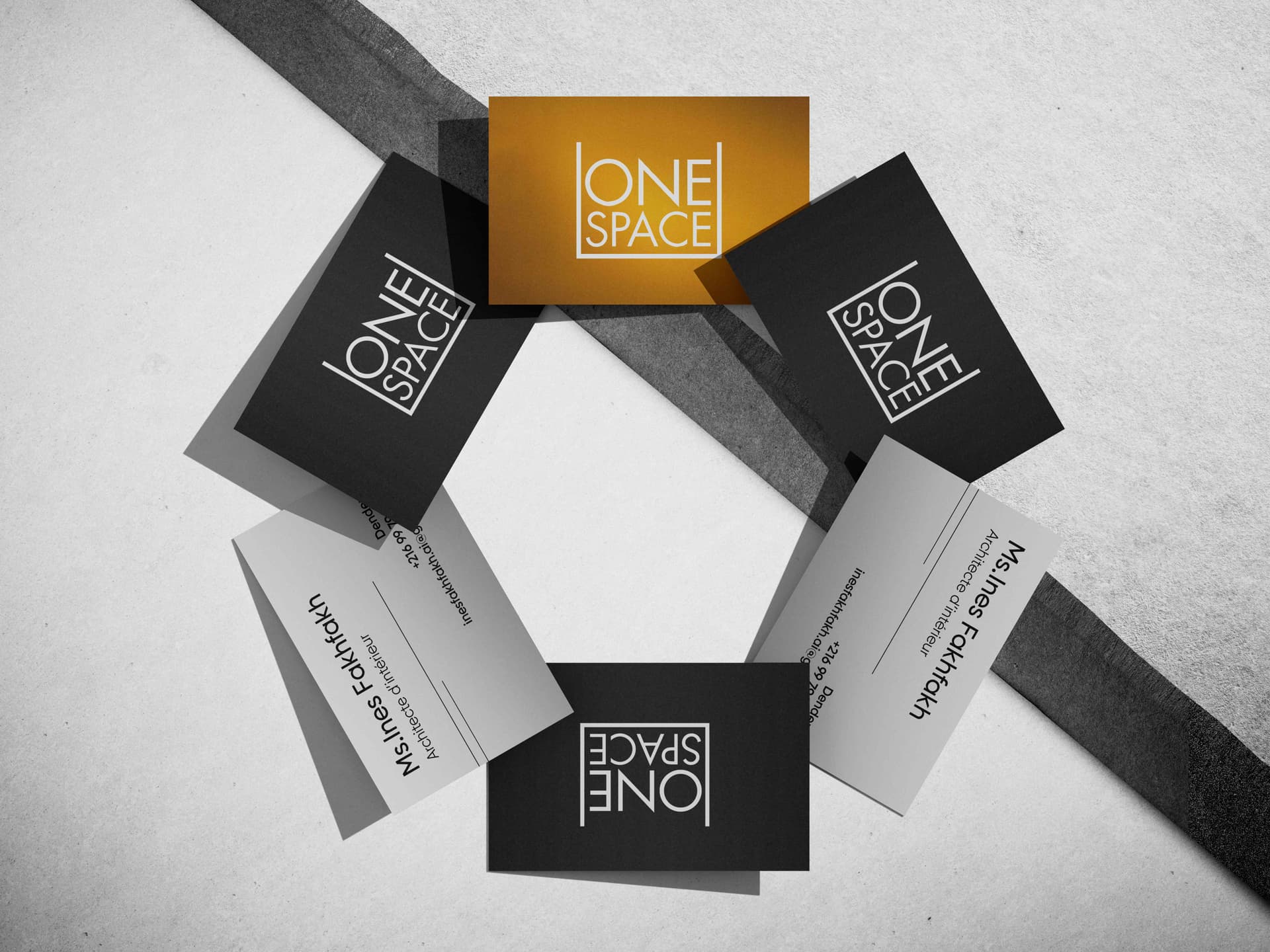
Create a full identity: logotype, monogram, business cards, letterhead, and social headers. The client wanted something that feels premium and minimal, not loud.
The logo-mark
I designed a combination mark: a geometric monogram paired with a refined wordmark. Gold is used as a spot color for print and as a flat metallic tone for digital. Light and dark versions were built from day one so the logo never gets forced onto the wrong background.
Stationery & print
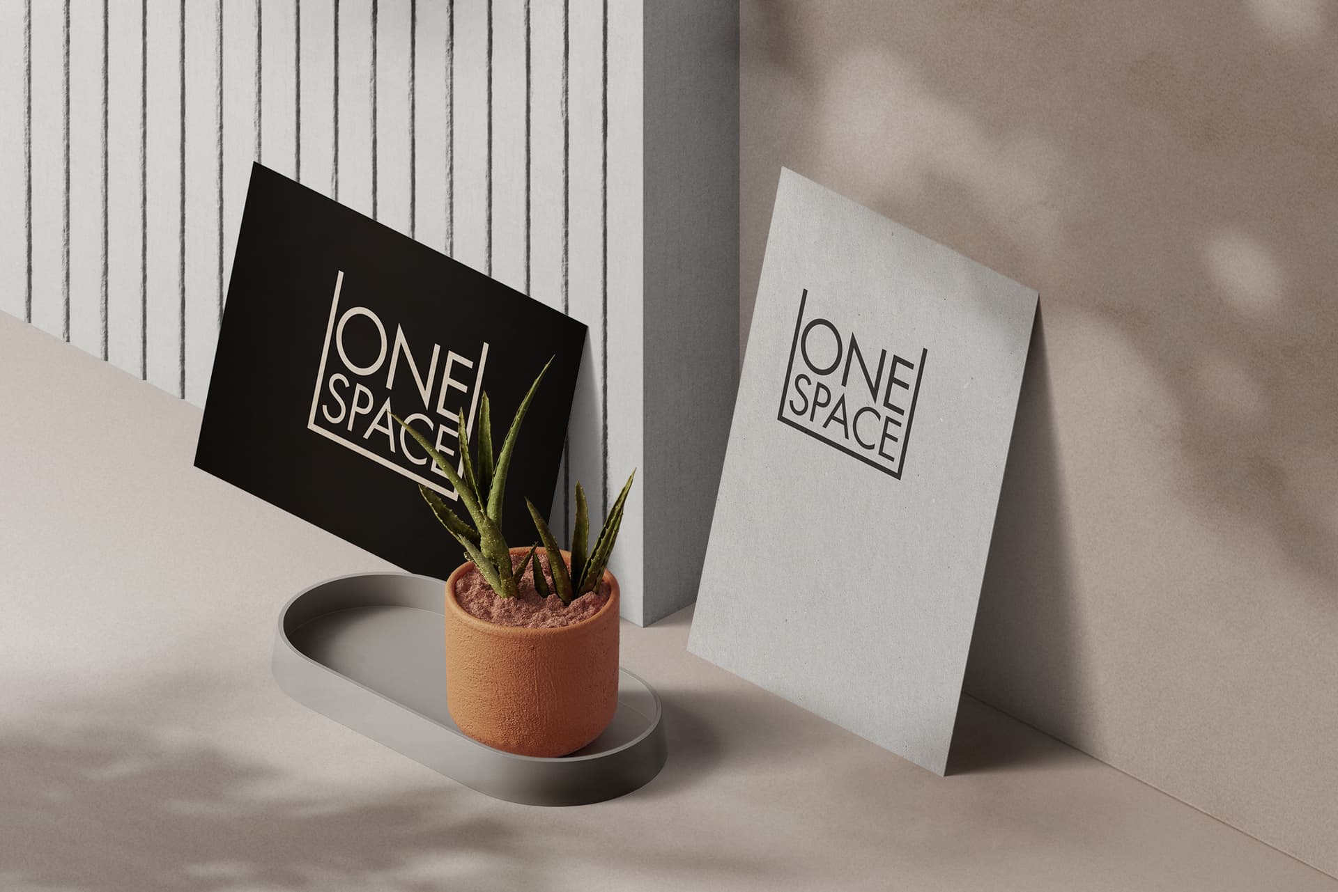
Business cards and letterhead use the same spacing system: generous margins, one accent line, monogram as a subtle watermark on letterhead. Print specs were documented so reprints stay consistent.
Outcome
The gold system is used across cards, letterhead, and client-facing PDFs. The studio reports that proposals feel more aligned and clients mention the branding before discussing scope.
Trade-off
A metallic gold system reads beautifully in print, but flat digital gold doesn't always hold up the same way across screens with different brightness and color calibration, I chose one flat digital gold tone for consistency rather than adapting it per platform, which trades a bit of visual richness on-screen for a system that's simple to apply correctly every time.
What I'd do differently
I'd test the digital gold tone against a wider range of phone screens and lighting conditions earlier, before finalizing it as the single digital spec, rather than relying mostly on my own monitor during design.
Tools: Illustrator, Photoshop, InDesign · Full set: Behance