
Packaging design for Tunisian export brands: winning shelf space in the EU
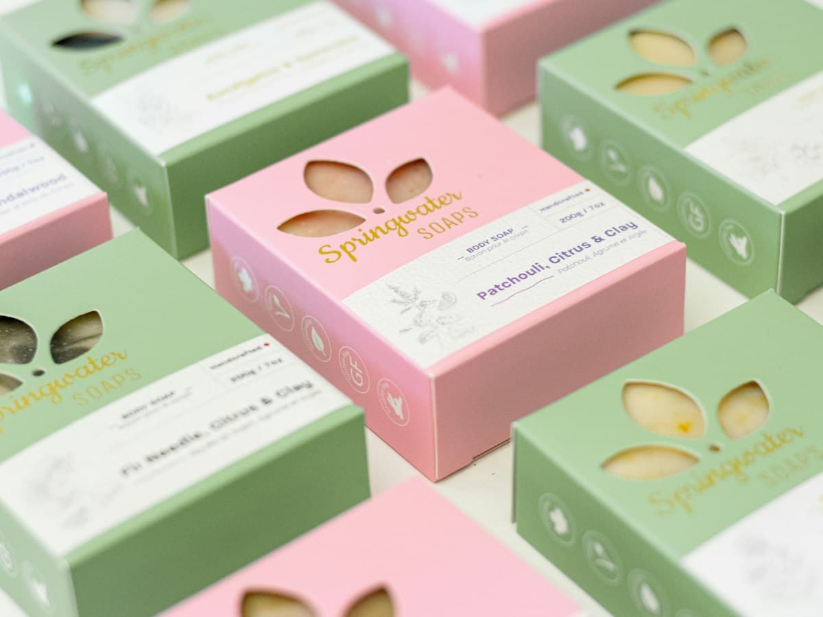
Tunisian olive oil, dates, and harissa are genuinely excellent products competing on European shelves against decades of category convention: Italian and Spanish olive oil design language, Middle Eastern date packaging clichés, French condiment aisle expectations. Good product alone doesn't win that shelf. Packaging is doing the entire first impression, in about two seconds, before anyone reads a word.
The shelf is not a portfolio
A common mistake I see from Tunisian producers is designing packaging like a print portfolio piece: intricate patterns, a lot of green-and-gold "heritage" cues, dense text about origin and tradition. It photographs beautifully. It often loses on a crowded EU retail shelf, where the eye is scanning fast and the product has to signal its category and its edge in a glance, not tell its whole story.
What actually earns the pickup
1. Category cues first, differentiation second. A shopper needs to instantly recognize "this is olive oil" before they notice it's Tunisian olive oil. Fighting the category's visual grammar too hard makes a product look unfamiliar rather than premium.
2. One clear point of difference, said once. Single-estate, organic, a specific varietal, a founder's story, pick the one true differentiator and make it the loudest thing on the label. Trying to say everything (heritage and organic and award-winning and family-run) usually says nothing.
3. Typography that reads at arm's length, in two languages. EU labeling regulation and multilingual markets (French, English, sometimes Arabic) mean your hierarchy has to survive three languages of text without turning into a wall of small type. Design the info hierarchy before you write the copy, not after.
4. Material and finish signal price point honestly. A soft-touch matte finish and restrained color palette read as premium; glossy, saturated, pattern-heavy design reads as mass-market regardless of what's inside the bottle. Match the finish to the price point you're actually asking for.
5. Compliance is part of the design brief, not an afterthought. EU import labeling requirements (allergens, origin, nutritional info) have to be planned into the layout from the first sketch. I've seen beautiful labels get reprinted at real cost because compliance text was squeezed in at the end.
The real opportunity
Tunisian producers have a genuine story: Mediterranean terroir, generational know-how, increasingly serious organic and sustainable practices. The brands that win aren't the ones that shout heritage the loudest. They're the ones that translate that story into a label a European buyer can understand and trust in the two seconds they'll actually spend looking at it.
Exporting a Tunisian product? I design packaging systems built for retail shelves and EU compliance from the start. See design work or book a free call.
Need help defining your brand identity?
Let's talk through your project.
Related articles
- How brand colors affect trust (and how to choose yours)· 4 min read
- Social media visual consistency: why your feed doesn't look like a brand· 5 min read