
Designing bilingual brand identities for Tunisia's Arabic-French market
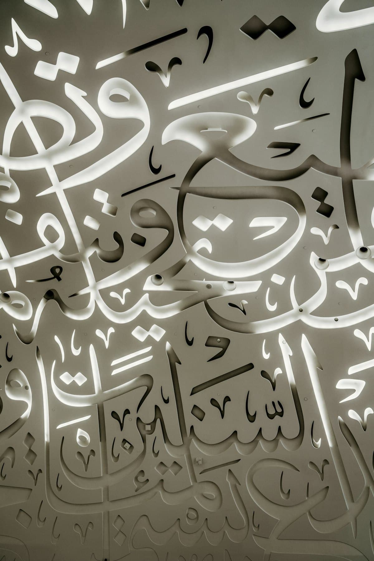
The first mistake I see in Tunisian branding is treating Arabic as "French, flipped." A logo gets designed in Latin type, and the Arabic version is an afterthought: same layout mirrored, same weight, same spacing rules, just swapped scripts. It almost never works, and clients can usually feel that something's off even when they can't name it.
Arabic and French aren't the same design problem wearing different letters. They're two different problems that happen to share a brand.
Why a mirrored layout fails
Arabic script is connected, has no capital letters, and carries meaning in the shape of the joins, not just the individual letters. A Latin typeface's weight and spacing rules don't transfer directly. A bold French wordmark that looks confident often turns illegible or clumsy when the same weight is forced onto an Arabic typeface that wasn't built to carry it. And RTL isn't just "text goes right to left": icons, arrows, progress indicators, and even where the eye naturally lands on a page all flip with it.
What I actually do
1. Design the identity twice, not once. Same concept, same color system, same emotional target, but the Arabic wordmark gets its own typeface, its own weight, and its own spacing pass, tested on its own, not derived from the French version.
2. Pick typefaces that were built as pairs. Fonts like Cairo, Almarai, or IBM Plex Sans Arabic were designed alongside a Latin counterpart specifically to sit next to each other without one looking like an afterthought. Starting there saves weeks.
3. Build the RTL layout as its own template. Don't flip the French template in Figma and call it done. Rebuild the grid so navigation, CTAs, and reading flow feel natural right to left, not mirrored.
4. Test at small sizes first. Arabic scripts lose legibility faster than Latin ones at small sizes because of the connecting strokes. If it has to work on a business card or a favicon, start there, not on a billboard mockup.
5. Respect the cultural register. Formal MSA reads differently than Tunisian dialect in copy, and the same is true visually, a youth NGO and a notary's office need genuinely different type choices in Arabic, the same way they would in French.
The payoff
A brand that treats both languages as first-class citizens reads as more credible to both audiences, not just "translated." For a market like Tunisia's, where most serious brands operate in both languages daily, that credibility is not a nice-to-have. It's the baseline people expect.
Building a bilingual identity? I design brand systems that work natively in Arabic and French from day one. See design work or book a free call.
Need help defining your brand identity?
Let's talk through your project.
Related articles
- How brand colors affect trust (and how to choose yours)· 4 min read
- Social media visual consistency: why your feed doesn't look like a brand· 5 min read